Many website makers and graphic designers are looking for Basic Fonts that produce simple and neat texture appearances. It is very important to select a font style that gives your designs and projects a stunning and amazing texture appearance that attracts the attention of people to read their designs and websites. It doesn’t matter how many colors and designs you put in your website or other writing materials without choosing the right font style.
So, choosing a simple and neat font plays an important role in creating the designs of websites, articles, or in any platform you want to use. The font that has an easy and readable texture appearance attracts the attention of the users and designers. Font should be that simple or easy to read that merely a child can easily understand and read the font.
The Top 20 Basic Fonts For Your Next Design
Here our team has collected some of the Basic Fonts that contain an easy and readable texture appearance. So, the collection of these basic fonts will help the users and designers to save their precious time and utilize these fonts in their designs and projects.
These fonts can produce amazing texture results for both the big screen and small screen displays. So, enjoy reading the details and utilizing these typefaces in your projects.
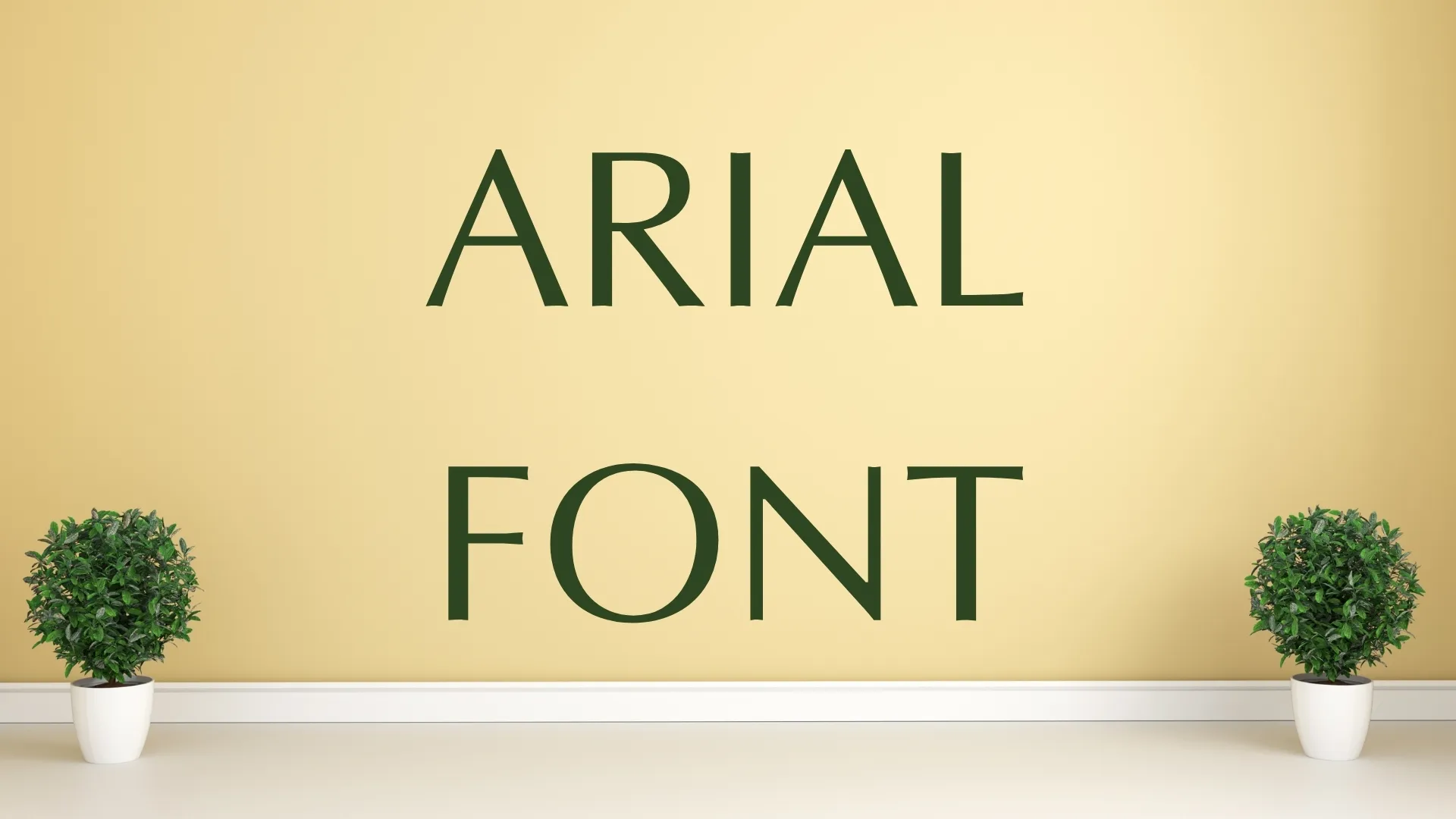
Arial Font
Arial Font is one of the most popular fonts in the Sans-Serif font family. This typeface is the basic font that is used in Microsoft Office. This pleasant texture style is designed by two designers name Robin Nicholas and Patricia Saunders.
It has the neatest and simple texture style that is perfect to use for writing material and creating documentations. This font style can easily adapt to any kind of usages and is easily utilized on any platform.
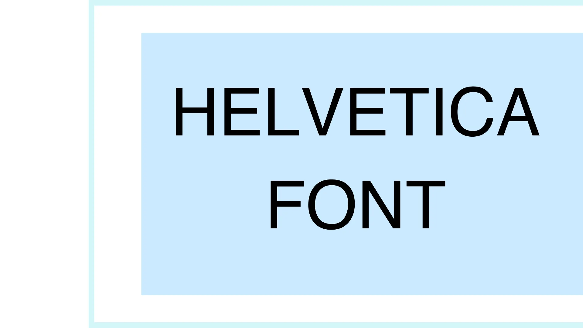
Helvetica Font
Helvetica Font is an amazing and readable texture design is created by Swedish designer Max Miedinger. It has perfectly easy and readable body text. It provides an easy texture style that is not different from the design of your websites and other writing materials.
The lack of creative features is not added in the design of this font was on purpose, which makes it simple and readable. But although this font is really popular in the making of designs or use as a body text in any kind of websites and documentation as well as creating reading articles.
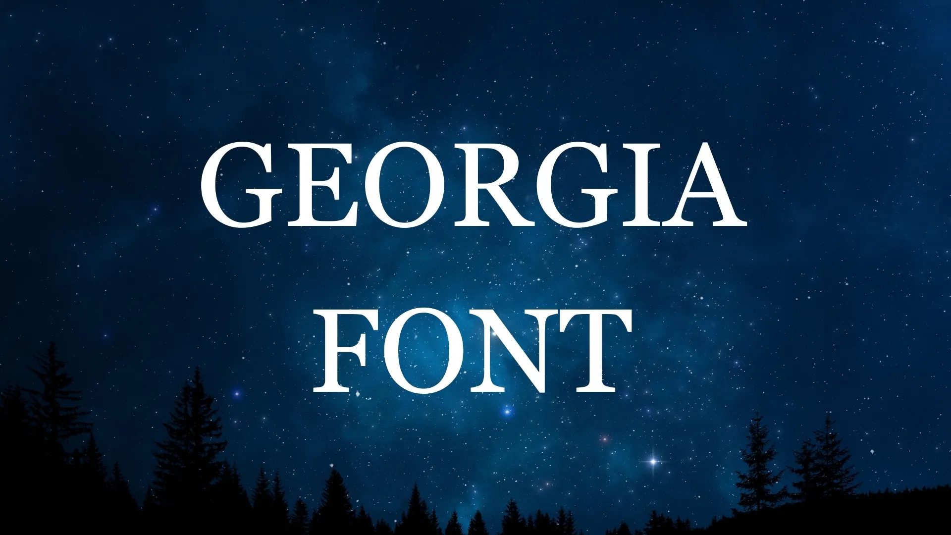
Georgia Font
Georgia Font has a clean texture got an appealing and neat texture style that gives the vibes of the old school. This classical typeface is manufactured by Matthew Carter in 1993. It was basically designed for Microsoft. It provides an excellent view of designs and articles as well as blogs.
It is best for creating body text on Websites and documents. It is also best for heading purposes in various designs and writing materials. It has been proved that the Georgia Font is produced amazing texture results in small and big screens because of its condensed texture style.
Merriweather Font
Merriweather Font is another amazing typeface that contains a very pleasant and readable texture that has condensed texture and an agreeable gap between letters that makes it perfectly simple and readable. This condensed is a type of Sans-Serif font family.
The users of WordPress will notice this typeface immediately that it is using on the previous default templates. The bold style in its family is perfect for headings for your designs and websites. It has a pairing nature that can also make pair some fonts to produce an even further amazing display.

Montserrat Font
Montserrat Font has one of the fine characters that has the perfect readability for any type of display size even they are big or small. This defined character typeface is designed by Julieta Ulanovsky. It is comprised of 09 weight and 18 syles.
It has a clear and defined texture that can easily utilize in websites, articles, presentations, both for headings and body text in designs. Its features include uppercase, lowercase letters, numbers. Punctuations, symbols, and multi-language support. This typeface is best for creating elegant designs and projects.
Restora Font
Restora font contains easy-to-read and formal texture features at a time both qualities. This amazing and readable font style is designed by Nasir Udin.
This font style offers a friendly combination with other fonts and a classical texture personality. This flexible font textured is best for creating book covers, branding the products, and body text on a website, and also best for heading purposes.
Libertinus Sans Font
Libertinus Sans Font is a classy and elegant typeface that has fine characters and texture appearance best for reading purposes. It has been constructed with 14 styles that can be utilized in many designs and projects. It has fine lines body texture that is best to use in writing materials and as body text in articles and websites.
This font can support a vast number of languages. The bold and condensed style in its family is perfect for heading and display uses in presentations and designs. This font is ideal for creating formal and elegant designs.
Quicksand Font
Quicksand Font is specially designed for mobile devices to produce simple and readable texture appearances. This awesome and clear texture style is developed by Andrew Paglinawan in 2008.
It has a family of its own that has different styles like bold, italic, and regular. As it is using on mobile devices for display texture it proves that it has the best body texture appearances. It is also legible for small sizes display that makes it unique in its own way.
Verdana Font
Here is another typeface that is quite identical to Georgia font. It contains a readable and fine texture appearance that provides the perfect readability to web designs. This font style is specifically designed for computer operating displays for best readability.
Through our team’s research, it is one the typeface that is considerable for elegant designs and especially for small screen displays. So, you can utilize this typeface in your websites and articles both for body texture and heading purposes.
Karla Font
This font style is in the collection of readable and fine texture fonts. It is best for both big and small screen sizes. This font style is designed by Jonathan Pinhorn well-known graphic designer. It is available in 7 unique styles that are perfect in their own way.
Bold styles are best for front displays and heading purposes. It has quirky grotesques that are not available in any other fonts that make it unique. It is best to utilize in creating articles, documentation, websites body texts, and writing materials because of this easy and unique texture style.
Ubuntu Font
This typeface is a humanist-style font style, a calligraphic typeface that means it is neatly designed with the vibe of handwritten texture appearances. It has one of the cleanest and readable font textures.
This typeface is a google font present in its library. This textured style is manufactured by a foundry located in London named Dalton Maag a well-reputed font-making foundry. In South Africa, the word Ubuntu means “Humanity”. So, therefore you can utilize this font in your websites, Articles, and headlines.
Lato Font
Lato font is one of the famous typefaces that are present inside google and adobe libraries because of its elegant and defined texture appearances. This typeface is perfect for explaining the idea of your mind to readers and what topic you are trying to explain.
This font is the best choice in creating websites, articles, books, etc. The bold style of this typeface is best for explaining the stability and seriousness of the topic. This amazing and defined texture style us designed by Łukasz Dziedzic in 2010.
Futura Font
If you are creating a blog, article, or website that has formal and casual meanings then this font is perfect to utilize in your designs. Futura Font gives the perfect vibes of formal plus casual to your designs and projects. It has an easy and fine texture that is properly understandable and easy to explain about the topic.
It has a clean and sharp texture appearance. So, it is best for you to utilize this font in your designs when your main focus is on the readability of the blog or article. This perfect and simple typeface is designed by Paul Renner, Tommy Thompson, and Edwin W. Shaar.
Open Sans Font
Open Sans is designed with a bit more space between the characters as compared to the regular font. That makes this typeface more valuable and easier to read. Google has done research on this type and conclusion that this font style is perfect for printing purposes, creating websites, devices interfaces, etc.
Through google research this typeface is best to utilize to create web content, mobile devices body texts, writing books and articles, etc. This pleasant and fine textures style is designed by a well-reputed designer named Steve Matteson.
Roboto Font
Roboto Font is created by Google itself for its android devices to produce the vibe of amazing texture appearances. This font texture is also utilized in Google Chrome a web browser. So, it proves that this typeface has a keen and fine texture that is best for creating reading textures like articles, presentations, websites, etc.
This textured style is also best for creating headings, front displays, and magazines covers as this typeface has bold letters than other typefaces that make it unique in its own way.
Minion Pro Font
Minion Pro Font is a classical typeface that has an old lettering style. It has a defined and pleasant texture appearance that is easily readable. The texture of this typeface is specially designed for body text in the designs and projects.
So, this font is perfect to use as body text in articles, websites, and presentations. It has more the 20+ display text size that is also considerable for heading and display purposes. This defined and amazing textures style is designed by Robert Slimbach.
Bookerly Font
It is an amazing font style that is perfect to utilize in reading articles and book textures. This easy and readable texture style is designed by a foundry named Dalton Maag a well-reputed foundry for creating many amazing typefaces. It is a serif typeface that is utilized in devices and apps of Amazon.
This font is used on the Amazon app that aids the user to read the texture easily without exerting any stress on their eyes. This typeface is perfect for creating texture content on websites.
Pluto Sans Font
Pluto Sans Font is created by Hannes von Döhren in 2012. The body text is extremely clear and readable. It offers a simple texture style that matches the look of your web pages and other writing materials. The lack of innovative elements in this font’s design was done on purpose to keep it basic and readable.
However, this typeface is widely used in the creation of designs and as body text in a variety of websites and documentation, as well as in the creation of reading articles. This large height of this font will provide better texture readability even of websites.
Tisa Font
Tisa Font style is a perfect typeface for reading purposes. This simple and neat texture style is designed by Mitja Miklav. It contains a defined and readable texture that is perfect to utilize in articles and blogs.
The texture of this font is perfect for screen legibility so it is also best to utilize in websites and presentations. This textured style is also best for creating headings, front displays, and magazines covers as this typeface have bold letters than other typefaces that make it unique in its own way.
Droid Sans Font
Droid Font is a neat and straight pattern with an open texture style that is perfect for long readings without exerting stress on the eyes. This and defined textures style are designed by Steve Matteson in 2007. This typeface is basically designed for small mobile screen displays to produce simple and easy-to-read font textures. It is ideal for creating blogs and articles.
It produces a fine texture display. Bold styles are best for front displays and heading purposes. It has quirky grotesques that are not available in any other fonts that make it unique. It is best to utilize in creating articles, documentation, websites body texts, and writing materials because of this easy and unique texture style.